Trial Guide
Product Management, Design, UX
mProve, the company that approached to me about building the Trial Guide app, had formed to provide tools for pharmaceutical trial administration. Their original product had been messaging-based. I had done work with mProve for a few years, helping to improve the administration interfaces for the messaging-based product. They approached me when they decide it was time to take the text-based product to the smartphone.

Detailed Planning Phase
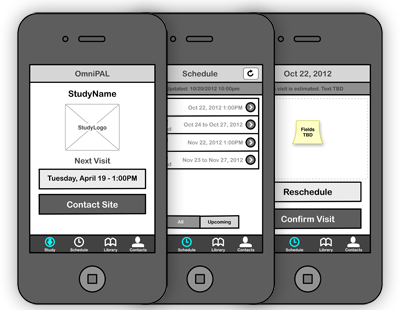
Taking the linear nature of a messaging app to an app-based user experience required a high level of planning up front. I developed user flows and wireframes so that the stakeholders and developers knew exactly how the apps would work before anything was built.
A well-planned first phase reduced implementation time significantly.
Cross-Platform Flexible Design
From the beginning of the project, we knew that we would launch with both iOS and Android versions of the application. Every user interface decision was filtered through this need. I created a modular, clean design that allowed us to easily make adjustments based on the platform-specific interface needs.

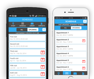
A modular design let us develop across platforms quickly.
